Archive for January 2012
Russian elections: Electronic ballot boxes
I got my hands on a list of precincts where electronic ballot boxes were used.
An electronic ballot box (in Russian they are called KOIB which stands for “complex for processing of electoral ballots”) can scan ballots, store the counts in memory, save them to a flash card, print out the tally. They are typically installed in pairs which share a common database, for redundancy purpose. They can also be connected to some sort of centralized database and transmit the tallies there directly.
Supposedly, the KOIBs should make it more difficult to forge the tallies and to stuff in extra ballots. It’s still possible to stuff, but each ballot would have to be scanned separately, so it becomes really time consuming.
The list of precincts which utilized KOIBs was compiled by Russian fraud buster enthusiasts from some government purchase contract documents. The list contains about 4,000 precincts which is less than 5% of the total number of precincts. Anyway, lets see what the data looks like, it looks really interesting!.
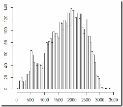
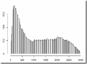
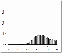
Distribution by precinct size, automated precincts on the left, general population on the right:
As I previously showed, the statistics of voting at the smaller and larger precincts differs drastically. So in order to compare apples to apples, I’m going to break down the automated precincts by the same size criteria as I previously applied to the general population. I’m going to name the category of automated precincts with < 800 registered voters “K2” and the category of automated precincts with 800 to 3000 registered voters “K3” (K for KOIB) and compare them to the corresponding C2 and C3 categories.
K2
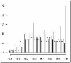
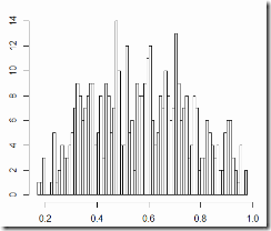
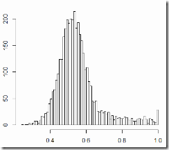
Turnout on the left, votes for United Russia on the right:
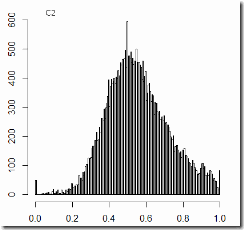
And here is the data for the C2 category (all precincts smaller than 800, outside of the ethnic regions):
Average turnout is the same (70%), and support of the ruling party is 57% at the KOIB’d locations vs. 56% at all locations.
Frankly, I did not expect this result at all, and I had to double check what I did. I conclude that at least one of the following is true:
- The data on the KOIB adoption is unreliable, or maybe the KOIBs were installed but weren’t used at the smaller precincts
- The KOIBs do not help mitigate fraud at all
- There was no significant fraud at the C2 locations (I think this one is the least likely explanation of the data. Until this moment I was sure that C2 must have had more voting manipulations than C3).
But let’s move on to K3 and C3…
K3
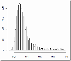
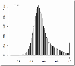
Turnout on the left, votes for United Russia on the right:
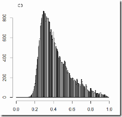
And here is the data for the C3 category (all precincts with 800-3000 voters, outside of the ethnic regions):
Alright, here a difference is seen.
Average turnout: 55.4% vs. 56.4% Average vote: 35.4% vs. 41.7%
Is this difference significant?
Some would claim, it is ENORMOUS! The probability that a random sample of the same size as K3 picked out of C3 will have the vote % lower than say 37, can be safely described as “never”. So K3 is not a random sample, for sure. And who in the right mind would expect that the KOIBs are scattered randomly. Their placement must correlate with some social factors.
Only about 8% of precincts in C3 had the KOIBs. And 80% of precincts in C3 have the vote percent < 55. And if we randomly sample from those 80%, we will always be getting the average vote around 35%, regardless of how many KOIBs are in the sample.
On the other hand, the 35% figure looks suspiciously close to the number obtained from the observers’ copies of the tallies at http://ruelect.com/en/
Once again, I cannot make any strong conclusions. But if we assume that the KOIBs did help reduce fraud, then we must once again admit that the fraud did not inflate turnout and was not responsible for the vote-turnout correlation.
With respect to the social conformity theory, the automated precincts fit the entropy curve very nicely with no surprises.
Ramsey numbers, quantum computing, hype
World’s Largest Quantum Computation Uses 84 Qubits:
http://www.technologyreview.com/blog/arxiv/27483/?p1=blogs
That’s cool, but the article totally misleads the readers as to what actually was computed.
Bian and co say the calculation for R(8,2) used 84 qubits, of which 28 were used in the computation and the rest for error correction. It took just 270 milliseconds. The result is 8 (as has been known for many years by conventional methods).
The result is 8 (as has been known for many years by conventional methods).
It’s like saying “2×2=4 has been known for many years by conventional methods”. R(n,2) = n is in fact more trivial than 2×2=4. It basically means that if you take n points and connect some of them, then either all of them are disjoint or at least 2 of them are connected, duh.
See here http://www.cut-the-knot.org/Curriculum/Combinatorics/ThreeOrThree.shtml for a nice popular explanation of Ramsey numbers.
Also, somewhat related combinatorial problems that I wrote about: Crocodile dinner, Crossing lines
GoDaddy, 302 random redirect and Google
Xworder used to hold the top (2nd-3rd place) position in Google search results for find words from letters. It’s still at the 3rd place on Bing, but Google now only mentions Xworder at the bottom of the 2nd page.
It took me a while to understand what’s going on. Apparently, the GoDaddy server that hosts Xworder issues “random redirects”:
Google hates those redirects and when it sees them often, it stops indexing the pages and demotes their search ranking.
You can find lots of blog posts describing this issue and blaming GoDaddy; many people are abandoning GoDaddy because of it.
Those redirects are part of implementation of a threat management system. They are used to analyze traffic patterns in order to automatically detect DDOS and malware probe traffic from botnets. The redirects are issued whenever the site is first visited from the particular IP within a certain time interval (“once per session”).
Most likely, the TMS is being implemented by a 3rd party vendor, not by GoDaddy internally. There are some reports that the same redirect behavior has been observed at other hosting providers too.
Of course it sucks that the people who designed that TMS never considered its impact on SEO.
But what really sucks is Google. A chain of 2 redirects breaks Google!? What’s up with that?
I’m guessing it’s because of the way Google implements redirect loop detection. When they see a redirect back to where they’ve been before, they consider it a loop. But it’s not a loop.
GoDaddy says they are working on this (no ETA), but shouldn’t Google be working on this too?
Russian Elections and Social Conformity: take 2
Here is another attempt to test the social conformity theory with 2011 Russian Elections, using Stephen Coleman’s methodology. I’m going to present basically the same data that I presented here but with more statistical rigor. I also show that after removing all ballots cast for United Russia from the valid vote count, the remaining data still fits the entropy curve very nicely. It would also be interesting to see what happens if the count of registered voters is accordingly adjusted (as if those voters were not present in the population). I’ll look into that when I have more time.
If you’d like to understand what this is about (entropy of choice and expected correlation between the party choice and the turnout choice) I encourage you to read these Coleman’s works, they are short and very accessible: Russian Election Reform and the Effect of Social Conformity on Voting and the Party System: 2007 and 2008 http://mpra.ub.uni-muenchen.de/14304/ (final published version here: Coleman, Stephen. 2010. “Russian Election Reform and the Effect of Social Conformity on Voting and the Party System: 2007 and 2008.” Journal of the New Economic Association (Moscow), 5: 72-90. In Russian as “Реформа российской избирательной системы и влияние социальной конформности на голосование и партийную систему: 2007 и 2008.”) and A Test For Conformity In Voting Behavior http://citeseerx.ist.psu.edu/viewdoc/summary?doi=10.1.1.31.4615
Some more background. 7 parties participated in the 2011 Russian parliamentary elections. The United Russia party (the ruling party) won by a landslide. There is evidence (eyewitnesses, photo, video) of massive fraud that took place during voting. There is evidence (http://ruelect.com/en/ which I also mentioned here) of massive fraud that took place during vote counting. There are also tons of blog and press publications of attempts (mostly amateurish, imho) to detect and quantify the fraud purely by statistical analysis. Most of them are based on the assumption that in honest elections party support and voter turnout are not correlated. (Here is a published example of this approach: http://vote.caltech.edu/drupal/files/working_paper/vtp_wp62.pdf) I personally find that assumption a huge oversimplification, and Stephen Coleman has shown http://citeseerx.ist.psu.edu/viewdoc/summary?doi=10.1.1.31.4615 that it doesn’t hold in many different settings.
Even more background. Here I demonstrated that the Russian elections data is highly inhomogeneous, and here I dissected it into 3 categories which have very distinct statistics: C1 – ethnic outskirts, C2 – smaller precincts, C3 – larger precincts.
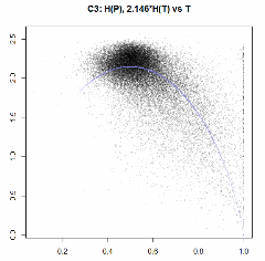
So here are Party Entropies vs. Turnout, fitted by Turnout Entropy, with distributions of residuals. NOT weighted by precinct size.
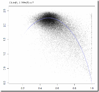
C3 (larger precincts).
“Coleman Factor” CF=2.146. Mean(H(P)) = 2.01.
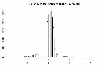
Residuals:
Min 1Q Median 3Q Max
-1.75576 -0.09590 0.04891 0.16276 2.42235
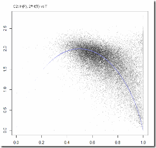
C2 (smaller precincts).
CF = 1.98. Mean(H(P)) = 1.66
Russian Elections: the facts (?)
Finally, all statisticians, mathematicians, sociologists, politologists and analysts of all sorts can take some rest. There is no need to mine the data or come up with models in order to detect and measure election fraud anymore.
Thanks to http://ruelect.com/en/
The folks are collecting copies of the tally sheets (“voting protocols”) obtained by observers on the day of voting and comparing them to the official results released by the Central Electoral Committee on the next day.
If their data is sound, the discrepancies are massive, stupid, and they are of course in favor of the ruling party.
I’m not going to analyze their data. I took a look at some samples. I still believe that the fraud did not alter the statistics of the elections in any detectable way. In the majority of samples that I looked at, the fraud did not result in too high vote ratio change, and the turnout ratio was almost never altered. All the tails are still there, they just became a bit fatter.
When I’m saying that I’m not going to study the data, I don’t mean that nobody should study it. Somebody must study it! For example, it would be really useful to see how much the forged data deviates from the social conformity curve (it does deviate!). That might help develop methodology to detect such fraud in the future.
I wonder why aren’t courts in Russia looking at this stuff.
Russian elections and the social conformity model
UPDATE: I found a bug in my calculations which resulted in discarded data points. I don’t know how big is the impact. (I’d guess that the “Coleman Factors” below are inflated) Don’t take the graphs below at face value. I’ll update as soon as I can. Bugs have been fixed.
UPDATE: I’ve posted a more rigorous version of this here. Everything in this post still holds though.
I mentioned Stephen Coleman’s social conformity model in the previous post. http://mpra.ub.uni-muenchen.de/14304/ Apparently, prior Russian elections were not the only tests of that theory. I found another work of Coleman where he demonstrates tests in many other elections. http://citeseerx.ist.psu.edu/viewdoc/summary?doi=10.1.1.31.4615 Apparently, party support and turnout correlations have been observed more than once or twice in honest (e.g. U.S.) elections. The coolest example is the US Presidential Election of 1916: it shows that below the maximum turnout the correlation changes the sign. This can be noticed (although not apparent) in the 2011 Russian elections too, and was for some reason interpreted by many as “another indication of fraud”.
Coleman considers only larger entities (like states and districts) and not individual precincts in his tests. I tried to quickly apply his approach to the 2011 Russian data, with individual precincts in the 3 separate categories C1, C2 and C3 into which I divided all precincts.
Please note that the graphs below are not real fits – I picked the factors by hand. That shouldn’t matter too much though, I think. Behold “Party Entropies vs. Turnout” which according to Coleman can be modeled by the Turnout Entropy curve.
C3 (larger precincts). “Coleman Factor” CF=2.25 (I’ll explain later what it’s supposed to mean)
C2 (smaller precincts). CF=2.
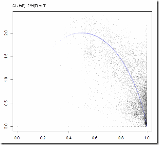
C1 (ethnic outskirts) CF=2, and this data that otherwise looks terrible, fits the conformity model rather well.
Now, what does the CF mean? Coleman interprets it as the information content of the choice, i.e. the binary logarithm of the number of parties that people were really making choice from. The value of 2 in C1 goes completely against my intuition. I’d say, people there were choosing from 2 parties at most. But I might have miscalculated the entropies or misinterpreted Coleman’s theory.
The relative values of the factors do look realistic. Opposition was probably much better supported at the larger precincts which leveled the ground. And for general population it is probably true that people considered choice among 4 (out of total 7) parties.
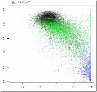
And here is a combined plot with the 3 categories in different colors:
Need to take a closer look at C2: it’s an outlier and it has a cluster of outliers inside of it. I’m thinking it’s a mix of some very different things…
Conclusions: a) Playing with data is fun, b) Beware, playing with data is very addictive, c) No other conclusions.
Russian elections: heads and tails
In the previous post I separated the voting precincts into 3 categories and now I’m going to use 2 of them – C2 and C3 to take a look at the correlation between the vote ratio and turnout ratio. People say that such correlation must never be there in honest elections. If it’s there – they say – it means that ballot box stuffing took place. I already mentioned that I don’t see how party support and turnout can be uncorrelated. One argument that I mentioned was that both quantities are correlated with the precinct size. The other one is that one’s electoral activity cannot be separated from the political preferences. Now that I have virtually “removed” the correlations mentioned in the first argument, the only one remaining is the weak sociological one. Anyway, let’s get back to the data.
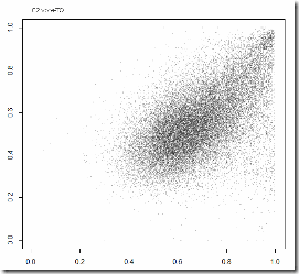
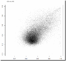
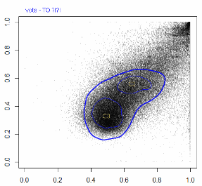
Vote ratio for United Russia vs. turnout ratio in C2 and C3:
Things to notice. First, both plots have fat vertical lines at 100% turnout (visible if you click the image). They are uncorrelated with the votes for UR and need a separate investigation. Second, C2 has a bad looking upper-right corner which may be yet another cluster consisting of smaller precincts. So let’s start with C3: it has a dense head and a tail. The head – they say – are the honest votes, and the tail is the stuffed ballots.
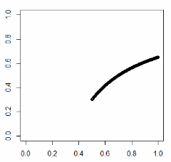
Ok, let’s assume that naturally all districts were sitting in the head (at 50% turnout and 30% party support). And then stuffing began. And what actually happens with the point on the diagram when we start stuffing ballots for UR in the box? Obviously – they say – it moves towards the upper-right. Not so simple. Let’s finally do a little math. We pick a precinct with let’s say 2000 registered voters. 1000 honest voters turned out and 300 of them cast ballots for UR. If we stuff x ballots then turnout becomes (1000+x)/2000 and the vote ratio (300+x)/(1000+x). As we increase x the point moves along a hyperbola (convex upward). When we stuff to the max (x=1000, 100% turnout), the vote ratio ends up being 65%.
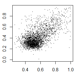
Great improvement, but this shows that the linear tail that goes all the way to the upper-right corner cannot be obtained from a round-shaped “honest head” by the “stuffing transform”. Okay, maybe we are not seeing the true shape of the tail because the correlation between the turnout and precinct size still interferes (there is still some correlation left there). Let’s take a sample of precincts that have between 1950 and 2050 registered voters. There is no visible correlation between size and turnout in this case. But the tail still looks the same:
Am I saying that such tail cannot be a result of stuffing? No. Of course it can. The original honest distribution could have had some tail too. Even if you believe it must have been normal, you could still come up with a stuffing model that results in a straight tail. And here’s the vote-turnout plot of the general population:
Could the whole C2 category be a result of stuffing something that originally looked like C3? Sure, if we assumed that “honest” smaller precincts would show the same turnout and vote ratio as larger ones, and then they were all stuffed in some uniform manner. Unlikely? I don’t know.
All this “analysis” is only a game with numbers. Stuffing does not shape the data any differently than real party supporters who come and vote. Until we have a decent model of voter’s behavior, we can’t detect and measure any stuffing by looking at the data.
It is known from eyewitnesses that stuffing took place (at least, was attempted). Moreover, it is known from eyewitnesses (and photo/video evidence) that simple forging of tally sheets indeed took place. But without a model we cannot know how it shaped the data.
So, are there any models of voter behavior that we could apply here? We need to ask experts. I’m just having fun with numbers here. Here is, for example, a very simple “social conformity” model that was tested in (or derived from? no, see the next post) prior Russian elections http://mpra.ub.uni-muenchen.de/14304/ . It indeed predicts correlation between the vote and turnout ratios. Also http://www.google.com/search?q=multinomial+model+elections could be helpful.
Russian Elections: dissecting the data
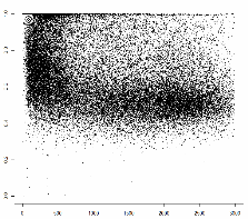
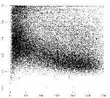
At the end of the previous post I demonstrated that all the voting precincts can be separated into 3 categories with very distinct statistics. Now I’d like to give it another try. First, why 3 categories? Look at the plots below (I presented them in the previous post too) – turnout ratio by precinct size and United Russia vote ratio by precinct size:
3 clusters are clearly seen: 1 – the upper-left corner: small precincts with very high turnout and very high support for UR; 2 – small precincts with turnout about 75% and about 50% votes for UR; 3 – larger precincts with TO around 50% and UR vote about 30%. The presence of these clusters introduces very strong correlations between precinct size and everything else. That makes it difficult to look at the distribution of vote and the correlation between the vote and turnout (that everyone is so excited about) in the whole general population. So here I’m breaking it down into 3 categories:
- C1 (14% of counted votes): the top-left corner is apparently very well correlated with geography. Those are ethnic outskirts: Bashkortostan, Dagestan, Ingush, Kabardino-Balkar, Karachaevo-Cherkess, Mordovia, North Ossetia, Tatarstan, Tyva, Chechnya. (This identification is approximate).
- C2 (13% of counted votes): precincts with less than 800 registered voters outside of C1.
- C3 (72% of counted votes): precincts with 800 to 3000 registered voters outside of C1.
(the remaining 1% is the Occupy Movement are very large precincts, mostly embassies in foreign countries, they are spread more or less uniformly by all variables)
Below are some graphs for each category with some funny comments. I’m not plotting vote-turnout correlations because that is what I’m planning to discuss in the next post.
C1
Vote distribution, turnout distribution:
Elections and statistics
Everybody and their brother is demonstrating their skills in statistics by doing analyses of the 2011 Russian parliamentary elections. Some of them are interesting. And some are unfortunately “lazy research”.
I’d like to briefly comment on the main points made in those analyses. Those points are mostly concerning “anomalies” in the distribution of the vote percent for the United Russia party (the ruling and the most popular party in Russia, also known as “the party of swindlers and thieves”).
Note that I’m neither trying to refute any conclusion, nor playing devil’s advocate. I’m playing “diligent researcher”. At the end of the post I include some graphs too.
- “The distribution of votes for United Russia is very different from the normal distribution.” We cannot expect it to be normal because of massive territorial inhomogenity in Russia. What we see is a mix of a number of very different distributions. Sort the precincts by district and plot the percent of vote vs. precinct number. You’ll see what I mean by territorial clustering and inhomogenity.
- “The distribution of votes for United Russia is very different from normal, while the distributions of votes for the other parties are very close to normal”. The distributions add up to 100%. The UR distribution is simply (1 – AllOthers). So saying “all the distributions but one are OK” is just ridiculous. The other parties’ distributions are very different from normal too. Moreover, plot the UR votes versus the Communist Party votes and you’ll see that they are a linear transform of each other. So their distributions are in fact very similar. So when people say “the distribution of vote for Communist Party follows the model, while distribution for United Russia does not”, that means they have some model that explains (1-x)/3, but does not explain x. Some weird model.
- “The percent of votes for United Russia correlates with the turnout percent”. There are many natural reasons for that. First, both percentages correlate with the precinct size. Because the precinct sizes are clustered by territory, and also for purely arithmetical reasons (see the Dumb Model below). Second, the person’s political activity is obviously correlated with their political preference. Moreover, this correlation (even its sign) may be very different among different social and geographical clusters. Although it is difficult to model the correlation between turnout and party support, it is obvious that some correlation is naturally present. We must not assume zero correlation as the null hypothesis. However, speaking about turnout, I can’t explain the very high turnout at many large precincts.
- “The distribution of votes for United Russia has peaks at round numbers: 50%, 60%, 65, 80, 85, etc.” This is a phenomenon that I think can be considered a red flag. Although some natural explanations are possible (see the Dumb Model below), and this had been observed in previous elections too.
The Dumb Model and diligence
Consider a country with two regions A and B. In A 90% of people support party P, and in B only 30% of people support P. And let’s assume each voting precinct has only 1 (one) registered voter. Let’s look at the distribution of votes. It will look like two peaks at 0% and at 100%. So it’s not normal. And in addition it perfectly correlates with the turnout ratio! And there are peaks at round numbers!! OMG, fraud!!!
This model is dumb. As we increase the size of the precincts the distribution will look closer to the mix of two normals and the peaks at round numbers will become less significant. But what if we keep the average size of precincts in A smaller than the average size of precincts in B? (Say, A is country side and B is city). And what if we have more than two regions? What if the signs and magnitudes of the correlations between the precinct size, territory, and party support vary? The model is no longer dumb. And it may fit the observations.
I do not have a model like that, and I don’t know if anyone does. But it looks like no one is even trying to come up with one, even though a diligent researcher would definitely try. Diligent researchers would try, and even if they didn’t succeed, they would still publish about those attempts, rather than resort to a “simple hypothesis which explains everything”.
Illustrations
1. Territorial Inhomogenity/clustering
Lazy research leads to conspiracy theories
Some researches want to produce loud results without putting much effort into actual research.
Lazy Researcher: I have computed the distribution of humans by weight and it looks so weird! Obviously, there are aliens and cyborgs among humans!
Diligent Researcher: I have modeled the distribution of humans by weight taking into account age, sex and ethnicity. The modeled distribution looks similar to the actual one. I still need to include more variables and to model some non-trivial correlations, and I think I can fit the data even better.
Lazy Researcher: Your model is so complex and yet it doesn’t fully explain the observed data. And my model is so simple and it fits the data perfectly. Obviously we must accept mine.
Diligent Researcher: Your “model”?! What model?
Lazy Researcher: Okay, okay. Here’s the distribution of aliens and cyborgs, here’s their calculated ratio among humans, and the significance of this stuff is 5 sigma!
Diligent Researcher: Do you realize that your theory is not falsifiable? You could fit any data by tuning the parameters. And your “5 sigma” is deviation from the hypothesis that all humans are the same, which is laughable!
Lazy Researcher: I have presented a model that fits the data, and you have not. You are trying to refute my method without offering an alternative… Looks like you have an agenda… OMG, YOU ARE ONE OF THEM!!!
What is this all about? This is about the “statistical proofs” of fraud in the latest Russian parliamentary election. Some of those “proofs” are more shameful than the fraud itself (which did of course take place, as we know from anecdotal, photo and video evidence).
